
Introduction
LaunchSource is a hiring platform for entry-level talent looking to launch a sales career in high-growth tech.
Business Objective
LaunchSource aimed at empowering and developing young leaders through learning experience platform. The goal was to make changes to the UI & increase engagement/retention by creating amazing user experience for the next iteration. I mainly focused on visual side of redesigning learner/manager dashboard.
Methodologies & Tools
• Competitive analysis, user interview, contextual inquiries, information architecture, affinity mapping, site mapping, personas, user flows, sketching, wireframing, whiteboarding, usability testing, & prototyping.
• Sketch, InVision
Team Project
• Kha Nguyen (UX/UI Designer)
• Kristina Tummino (UX Researcher)
• Liz Maloney (UI Designer)
• Charron Mathew (UX Designer)
01
Understand needs
Review competing learning tools and learn how learners and managers track progress.
02
Structure the experience
Map information architecture and user flows around learning and oversight tasks.
03
Explore dashboards
Translate findings into sketches, wireframes, and visual dashboard concepts.
04
Test and refine
Use usability feedback to iterate toward high-fidelity learner and manager prototypes.
LaunchSource recently launched its first product, Ignite e-learning platform, to help training and placing young professionals at sale jobs.
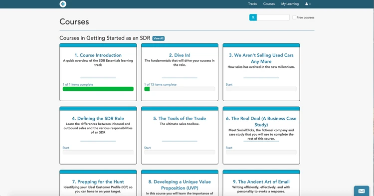
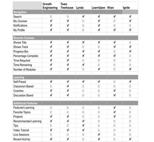
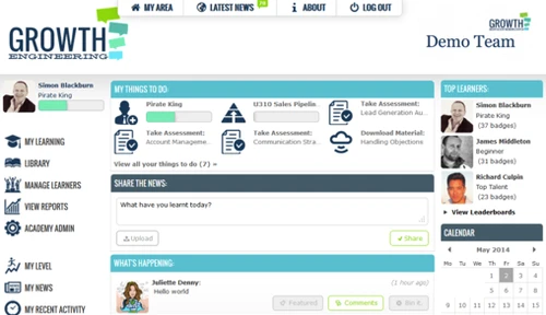
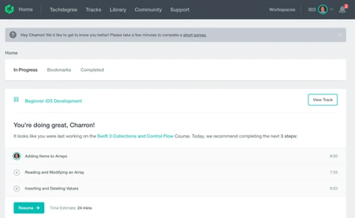
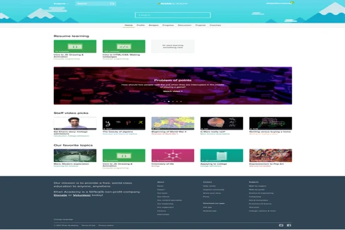
The very first step we took was to discover some of the indirect competitors that have similar products with strong UI patterns. We wanted to focus on layout and feature designs for the purpose of engagement. By looking at these competitors, we want to see what conventions are used and how we can differentiate.
Break down the competitors’ and LaunchSource’s layouts
Growth Engineering

LearnUpon
Tree House
Khan Academy
Sketch versions
Growth Engineering
LearnUpon

Tree House
Khan Academy

LaunchSource
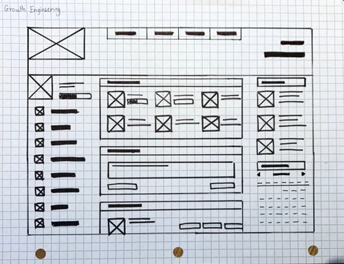
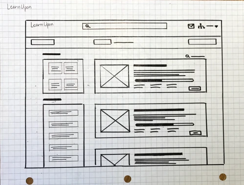
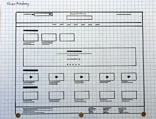
We took a chance to carefully analyze the interfaces to see if there was any click paths, core features that made these competitors successful. The purpose of doing rough sketches for these competitors’ layouts was to review and evaluate how products’ interface elements used to gain engagement from users. Those e-learning dashboards that we looked at all have many visual elements like videos, images which LaunchSource lacked of.
Before jumping into user interview step, we conducted 4 contextual inquiries to get a sense of what people think when actually use Ignite e-learning platform and to inform our redesign. These are key points that we learned from users:
• People didn’t notice the hamburger menu.
• Information architecture was misleading (i.g. tracks, courses, sections).
• People weren’t able to tell what section they were in.
• Repeated information was confusing (i.g. two
User Interview
We were able to conduct one interview with the manager who was using the Ignite product to get an understanding how user used the product and expectation from it. We learned that:
• Time is resource, manager wanted to know the amount of time learners spent on platform.
• Frequency of use & efficiency of use, manager expected learners to critically complete their courses and be able to know what areas that need attention as well as how frequent learners use the platform to improve their knowledge and skills.
The key takeaways from the research were trust and authenticity before engagement, felt experience, and every second counted.
The Problem
As identifying goals, needs, and pain points of users, we defined the problem that LaunchSource was encountering:
• Users need a way to be able to see what they’ve completed and what they need to do to accomplish their goals so they can advance their careers (Learners)
• Users need to track the course completion and be able to communicate with learners to help improving learning experiences (managers)
User Flow
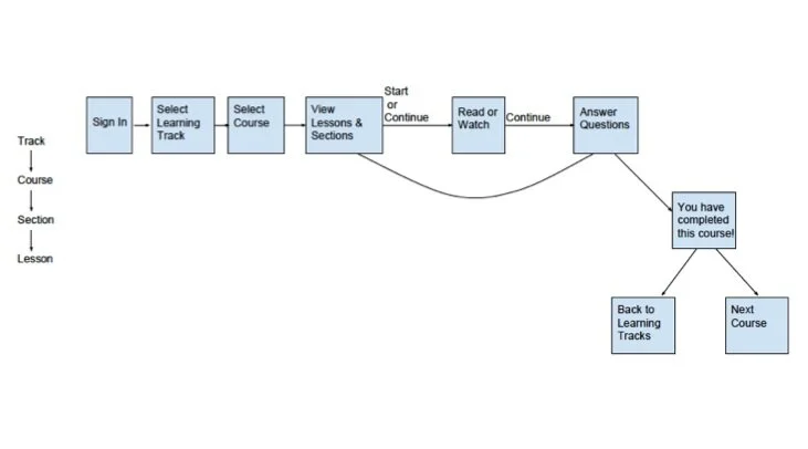
Site Map
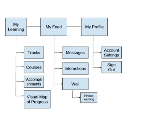
Based on information and data from our interview and research, we developed site map and user flows for Ignite e-learning dashboard to better analyze the efficiency of learners’ path. It was important to our team to share the dashboard vision and kept LaunchSource’s expectation, usefulness and engagement.
Design Principles
From all the research findings, we established some design principles to better inform our redesign decision as well as the overall goal of this project:
• Stay close to the brand, keep LaunchSource’s vision in mind.
• Design for engagement, understanding the hierarchy of trust and authenticity.
• Build what’s useful, time is resource.
Sketching
We used design studio exercise to create rough sketches. It was a way for our team to contribute ideas from various perspective and insight in an interactive, fast-paced team setting. We did several rounds of sketching and were able to combine ideas after open critiques. We moved forward to whiteboarding exercise, and created our first prototype.
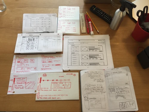
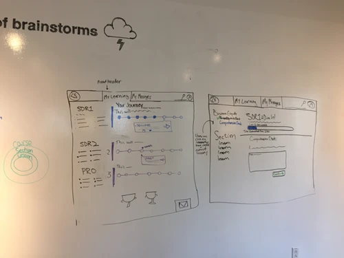
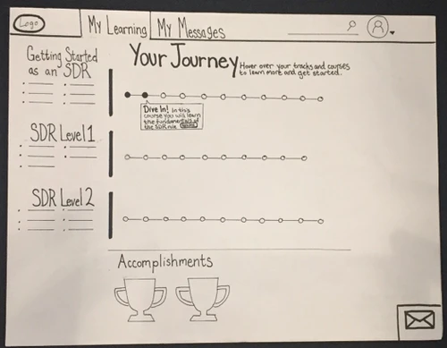

As we built out our paper prototype, we tried to keep the design not only conveyed aesthetic quality but also served the purpose of useful and engaging interaction for young professionals. Users wanted to be able to keep track of their learning progress as well as to be motivated to start their journeys.
1st Usability Testing
Our first testing was on site with LaunchSource employees and we learned:
• The tracks on the left hand side of the page were confusing and not serving the purpose of supporting the progress bar.
• The round progress bars were expected to be vertical or a map journey.
• It would be more useful and informative to show some visual effects to show users what section/part they were on (article, questions, or video icons, etc.)
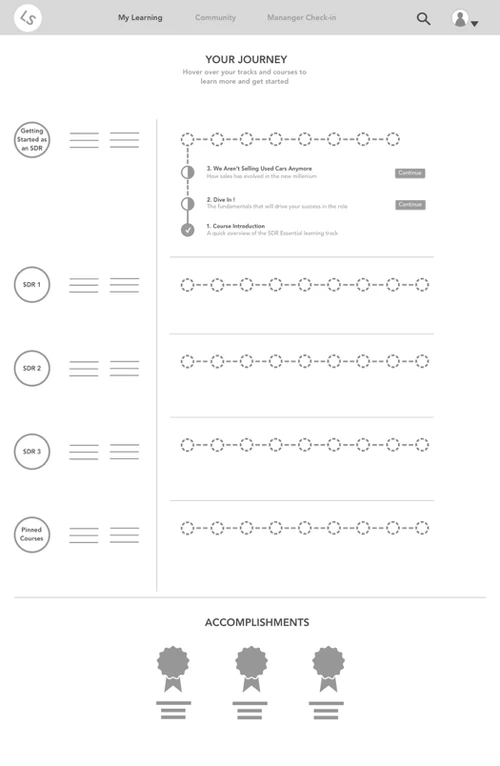
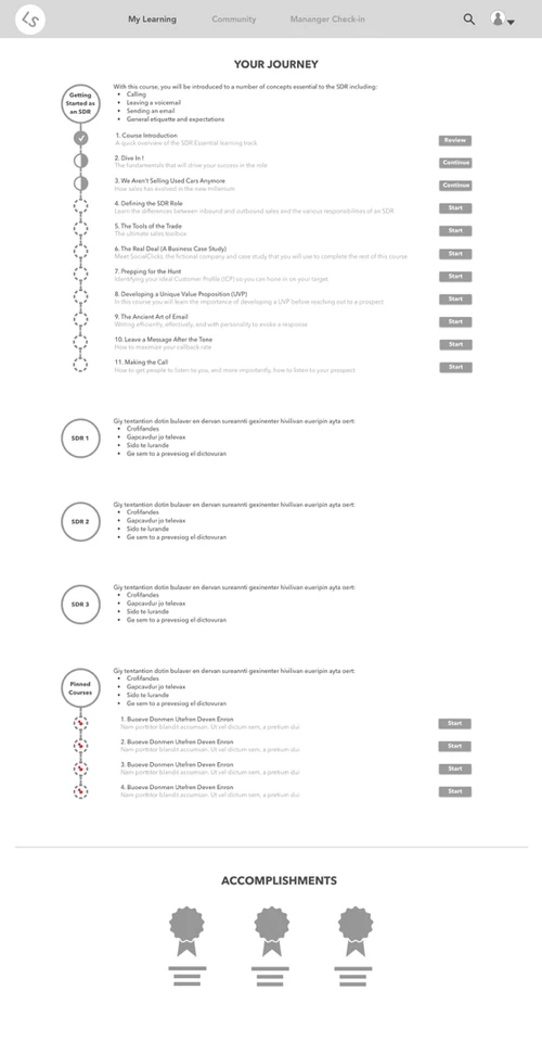
We moved forward with our first digital prototype and made some changed due to our feedbacks from usability testing. The progress bar became vertical and tracks menu were removed.
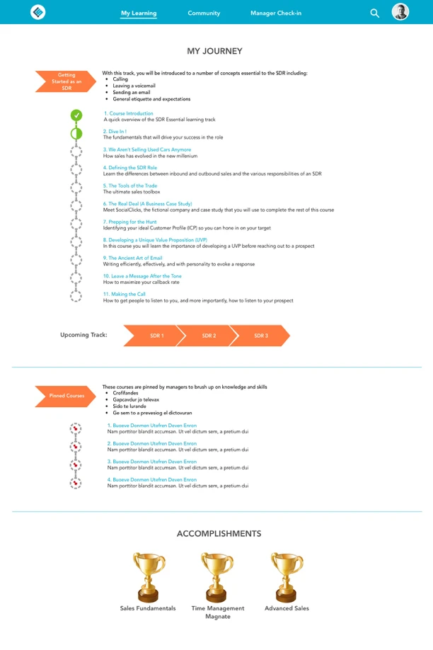
Through continued usability testing we continued to iterate into high fidelity. We removed the buttons from the landing screen and made track items clickable, and also used the prototype to show how mousing over track items can reveal small pop ups of descriptive info.
• Continued researches on young professionals who use E-learning dashboards.
• Future functionalities and features (managers’ sites, details of adding notification systems)
Exploratory Social Concept
Exploratory Social Concept
LaunchSource expressed interest in future iterations that the product would include some social aspects for managers and learners interactions. These allowed managers to communicate with learners, pinned courses/articles that mangers thought would be important for learners’ development, and made comments with shared ideas. We did some sketches for this feature based on our discussion with LaunchSource and with all the team members. The most important requirement was that this would only be internal within the organization of learners and it would be secure to communicate.