UX/UI E-Commerce Design
A team redesign of trip discovery: helping travelers browse and compare tours around the time they actually have available.
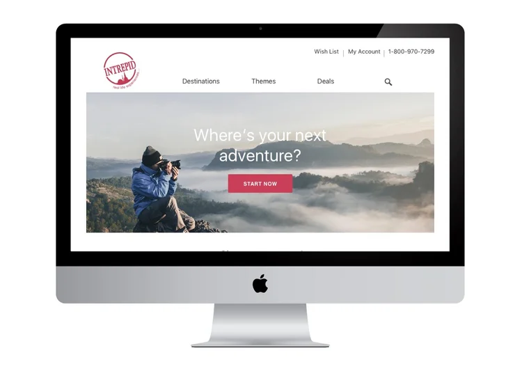
A travel company that provides tour packages for individuals, small or big groups of people. It takes care of itinerary, accommodation, activities, and everything in between to enhance the travel experience.
Team Project
Kha Nguyen (UX/UI Designer)
Stephanie Gama (UX/UI Designer)
Memo Martin (UI Designer)
Charron Mathews (UX Researcher)
Tools & Methodologies
Tools: Sketch, Invision
Methodologies: User interviews, competitive analysis, surveys, affinity maps, MVP diagram, user flow, personas, storyboarding, sketching, wireframing, high-fidelity prototypes
Design a feature that allows travelers to experience a smooth flow of browsing and searching for trips in order to choose destinations based on their vacation time availability.
01
Research needs
Interviews, contextual inquiries, and a survey revealed how time constraints shape trip selection.
02
Define the journey
Personas, storyboards, and flows focused the problem on finding trips that fit available dates.
03
Prototype options
Sketches and wireframes explored a clearer way to browse and narrow tour choices.
04
Test and refine
Paper and digital prototypes were evaluated in usability sessions to identify friction.
The first step that we took in the research phase was to explore the Intrepid website and study the core problem. Intrepid offered adventure group tours, but it had been getting customer feedback that searching for trips was difficult because of multiple steps. We interviewed 5 people, implemented 4 contextual inquiries, and received responses from 30 people through our online surveys.
Research Key Takeaways
Users need a convenient way to search fast.
Users who have a strict vacation schedule are highly concerned about booking trips based on their availability.
Users need a pleasing experience in order to book trips easily.
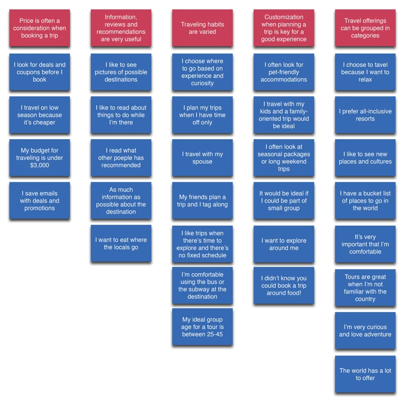
Affinity Diagram
We established the affinity diagram to organize a large set of data and identify the problem and solution by consolidating all the data collected. This really helped us make sense of the information so that we could craft a meaningful solution.
Persona artwork by Memo Martin
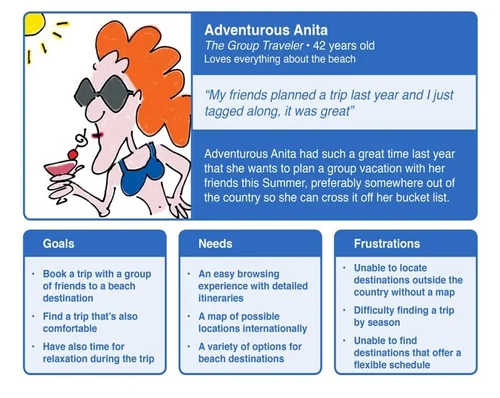
Anita (Primary Persona)
Anita loves traveling and she is in need of inspiration to book a trip with her friends. She wants a quick and easy browsing experience as well as a flexible schedule that helps tailor her main purpose.
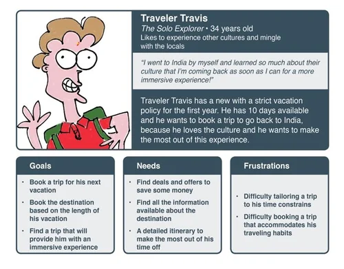
Travis (Secondary Persona)
Travis is an adventurer. He has a strict vacation schedule so his main concern is to find a trip based on his time availability. He also cares about deals and details about the trip.
Problem #1: As a group adventure traveler, I want to be able to search for trips based on my availability as well as insightful information about the destination so that I will enjoy my travel time.
Problem #2: As a group traveler, I want to discover different places and get inspired so that I will be able to go with all my friends.
Storyboard (Artwork by Memo Martin)
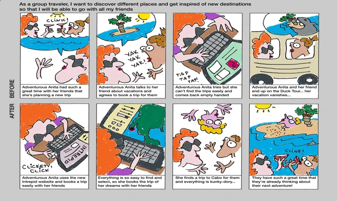
The scenario depicts Anita booking a trip with her friends to go to the beach using the Intrepid website.
Solution Statement: Create a better way for travelers to explore destinations, empowering them to find where they want to go quickly and book the trip based on their availability.
MVP Diagram & User Flow
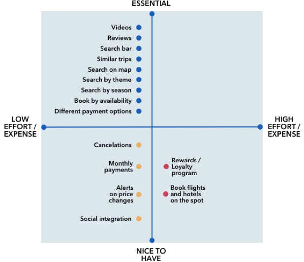
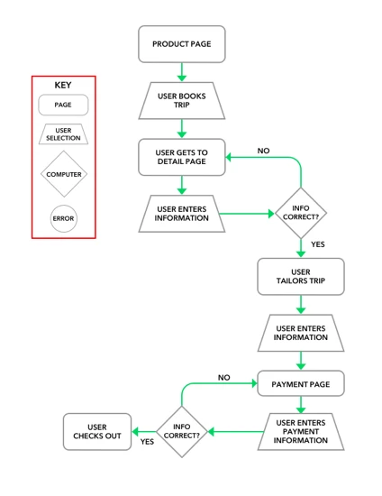
We started to list out some of the key features that would make group travelers’ booking experience with Intrepid as enjoyable as the adventure itself (consistent navigation, clean and simple layouts, and visually pleasing experiences). Based on information gathered from interviews and personas, we developed two user flows for the home page and product page. The user flows illustrated how personas search for trips and make decisions in booking.
User Flow
Based on information gathered from interviews and personas, we developed two user flows for the home page and product page. The user flows illustrated how personas search for trips and make decisions in booking.
Site Map

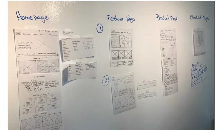
This was our very first stage of rough sketching, design studio, and whiteboarding activities, just to give us an idea of how we wanted the site to look and what main navigation to include. We created multiple paper prototypes, focusing on core features that enhance the travelers’ experience:
• For the home page, we designed a simple layout with a big hero image and a ‘Start Now’ button to support trip customization. We also added categories like Destinations, Themes, and Deals on top.
• For the feature page, we introduced a map to optimize searches. We placed filter options and a calendar next to the map to easily search based on dates and trip duration.
• For the product page, we highlighted details about the trip, itinerary, user reviews, inclusions, and similar tour suggestions.

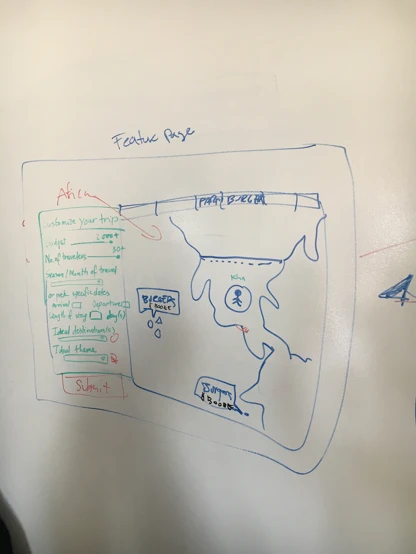
Design Studio

We used our design studio session to created multiple paper prototypes, focusing on main features that enhance travelers’ booking experience.
Paper Prototypes
• For the home page, we want a clear and simple design with big hero image having “Start now” button to support travelers’ trip customization. The home page also includes some feature activities and clear navigation on the top divided by “Destinations”, “Themes”, and “Deals” categories.
• For the feature page, we decided to have a map to optimize travelers’ searching purpose. We debated to have filter options either on the left side of the map or right below the map. The feature page focused mainly on the search ability based on time availability so we thought that a calendar would be crucial to have following with the duration of the trip.
• For the product page, it was important to travelers to have details about the trip as well as itinerary. From our research, users also want to see reviews, inclusions of the trip, similar tours.
1st Usability Testing
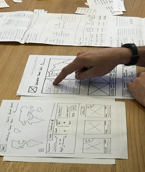
From our first testing session, we learned that users want to see something similar as some usual travel websites. It’s important to them to have consistency throughout the navigation and features. We created a new feature “Randomizer” to inspire users finding trips based on destinations and activities; this feature worked similarly as a wheel spinner. Testers found it really strange and confusing; they thought it might be redundant to include this feature since travelers usually got an idea where they want to go. Also, testers preferred the filter options placed on the left side of the map for better visual display.
Digital Prototype
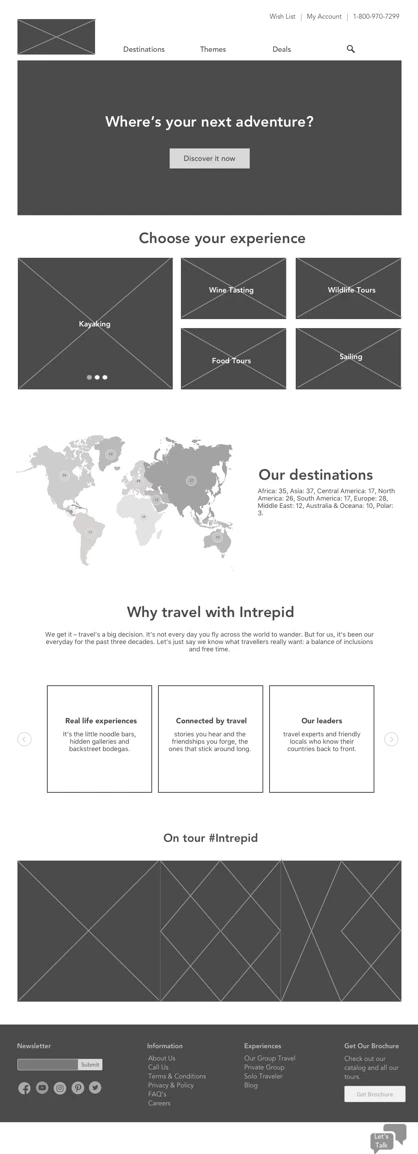
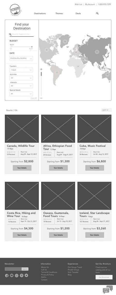
We finally moved to our medium fidelity prototype, gathering all the designs and ideas we have sketched in the process to create the most enjoyable search and booking experiences.
2nd Usability Testing
We used our critique session with other groups as a chance to demonstrate our second round of testing. It was really helpful as we got a lot of feedbacks. We had the calendar drop down but most of testers found it really confusing with the “travel start date” and length of tour options. It was not clear to them in term of flexibility. We went back and adjust the filter option to give user ability to search for trips effectively.
• Enhance filters and overall information architecture.
• A/B test ‘nice to have’ features.
• Explore new user controls.