UX Research
I used competitive analysis, a survey, and traveler interviews to understand where flight search creates friction—and which decisions people need to make with confidence.
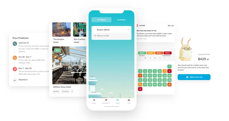
Hopper is a travel app that allows users to search for trips and accommodations. Hopper also predicts and analyzes airfares based on data and machine learning algorithm to enable users travel more often and get the best deal possible.
Role
UX researcher, individual project
Methodologies
Competitive analysis, survey, user interview
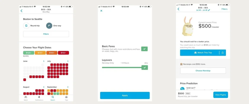
Travelers needed to compare affordable flights quickly, but limited filters, a long path to flight details, and a hard-to-find prediction made the search experience harder to navigate. The research focused on which choices mattered most.
To understand user expectations, behaviors, needs, and motivations when searching for flights or accommodations through methodological, investigative approaches.
To make sure product design decisions do benefit the user in achieving their goals.
To help identify unarticulated needs and fill any knowledge gaps about user’s challenge or issue when using the product.
01
Audit the experience
Review Hopper’s search journey and the information available when comparing flights.
02
Compare alternatives
Study competing travel tools and patterns for filtering, dates, and price context.
03
Listen to travelers
Use survey responses and interviews to learn priorities, confusion, and workarounds.
04
Synthesize opportunities
Connect recurring friction to clearer filters, hierarchy, and flight information.
Skyscanner
• Wide range of filter options
• Car rental options
• Flexible selection with dates & time
• Available in more than 30 languages
• Multi-cities flights support
Kayak
• Wide range of filter options
• Car rental options
• Allows users to see where they can go on their budget
• Track status of a flight
Expedia
• Wide range of filter options
• Multi-cities travel booking
• Offers chat feature with a travel expert
• Reward program and credit card
• Provides multiple travel tools
Hopper Strategic Advantages
• Color-coded prices: Make it easy for users to scan which date will have cheap price.
• “Watch the trip” feature: Send users alert if the price change.
• Price prediction: Predict whether if the price for chosen dates will drop or not.
• Hotel deal request: Users can request secret deals from hotels and save up to 30% off web prices.
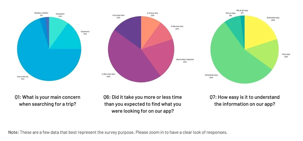
The goals are: to examine if users experience a smooth flow of browsing and searching for flight tickets and accommodations, to determine if they face any problems using the search feature, and to collect quantitative data on what users look for when searching for a trip.
Procedure
1
Determine the goal - Narrow the focus to the search experience and find insights into what people really want in flights.
2
Define profile of participants - Make sure target users align with the survey purpose and are represented in a group of users who want to find the best way to search for cheap flights.
3
Create questions - Identify types of questions to ask that can help get meaningful responses and insights from participants.
4
Analyze survey responses - Look for trends and patterns to get a broad sense of users’ needs and problems. Consolidate these responses with existing research data to draw conclusions.
70%
of respondents care more about the cost of flight or accommodation over other factors
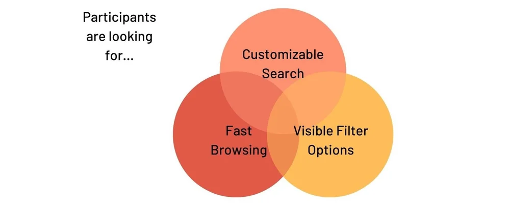
• Current search feature seems to lack some filters that can help users customize their search experience.
• There’s a need to create helpful filters to allow users search and book flights that accommodate their needs.
• Users also care about visual hierarchy of the app to make sure that all the information are scannable and easy to find.
The goals are: to obtain user feedback and quotes on searching experience when looking for trips and accommodations, to have actual interaction with users to understand their behaviors, needs, wants, and issues, and to collect qualitative data to incorporate with quantitative data from the survey.
User Interview Questions
• What are your initial thoughts on the home page?
• Can you walk me through your thought process when doing the task X or using search feature?
• Can you tell me about a time when you couldn’t find what you searched for?
• Can you share an experience using another travel app to search for trip prior to knowing Hopper? How did it go for you?
• What would be your biggest concern when you search for a trip? Why is that?
• If there’s one thing you want to improve about this website, what would it be?
Common Theme & Direct Quotes
“
I can’t do much with filter options. There’s only two choices now.
— Chelsea
“
I wish it could take less steps to get to the flight information.
— Ken
“
When I search for flights, I want to compare prices. I like how Hopper has color-coded calendar so it’s easier to see which days have cheaper prices.
— Franchesca

• Most participants complain about the steps needed to get to flights.
• A few participants did not notice the price prediction that is hidden all the way down of the screen, emphasizing the need to make it more visible.
• The path to payment is pretty uncluttered.
• Participants have difficulty to determine what to do or press.
• Participants think color-coded calendar is efficient to keep track of price change.
Final Evaluation Critique
Minimal search filter
Users only have options of round trip and one way flights during search. Filter only has basic fares and layovers options. Although departure and return calendar has color coded price, there’s no clear hierarchy.
Redundant CTA’s
Multiple call outs make it difficult to determine what to do or press. There is no clear hierarchy of color, copy, and icon to reference a certain action. The existing app also makes users go through a series of flight screens.
• Conduct contextual inquiries on current app to test user interaction.
• Establish design principle & guidelines.
• Move up to design phase with high fidelity prototypes.